
Alight Mobile
My role
Product Designer
Duration
4 months
Tools
Figma
Miro
Team
1 Product Design Director
2 Product Designers
1 UX Researcher
What is Alight?
A company serving over 4,300 global clients, including 70% of the Fortune 100
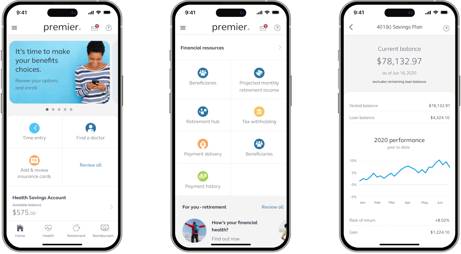
The Alight Worklife web platform supports 36 million employees and dependents, consolidating HR and benefits into a single portal. This simplifies engagement with health, finances, payroll, well-being, and retirement benefits. The Alight mobile app its a new product that extends these services, offering the full range of benefits right in users’ pockets.

The Problem
The app has a 2.3-star rating, negative reviews, and no longer aligns with the company’s updated brand and vision
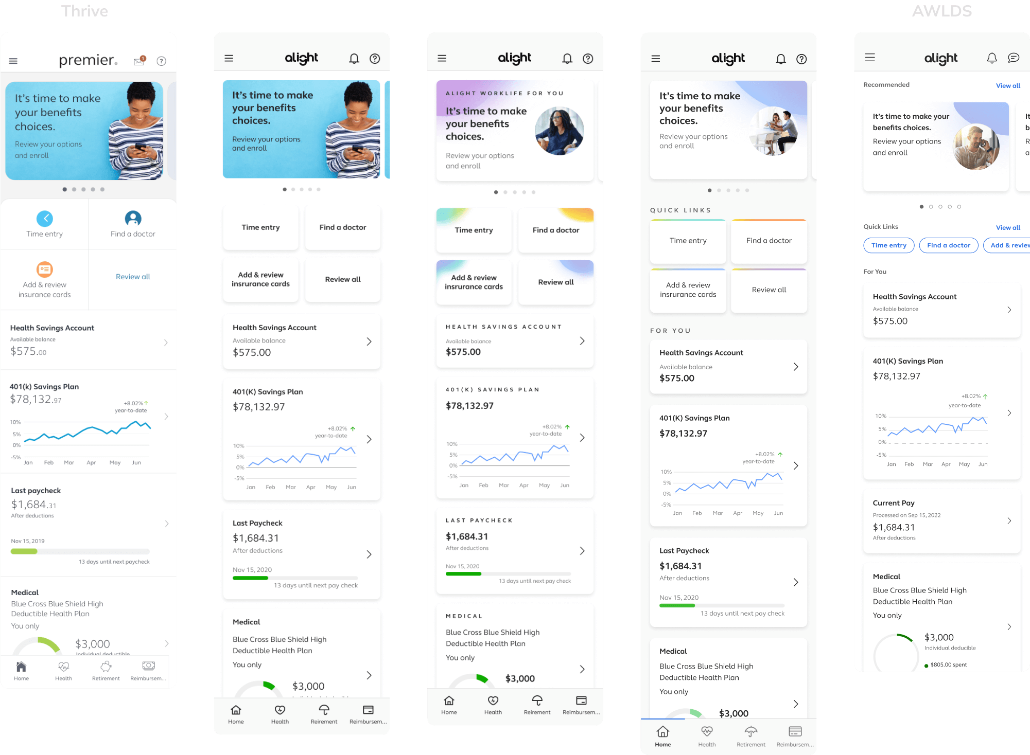
The AWLDS design system embodies the company's new values, mission, and vision, and the main platform, Alight Worklife, has been updated accordingly. However, with the focus on the main platform, the mobile app has lagged behind, leading to an inconsistent experience and a product that no longer aligns with the company's identity.
The Goal
Improve the mobile app experience by integrating the new design system, resolving usability issues, and enhancing key features
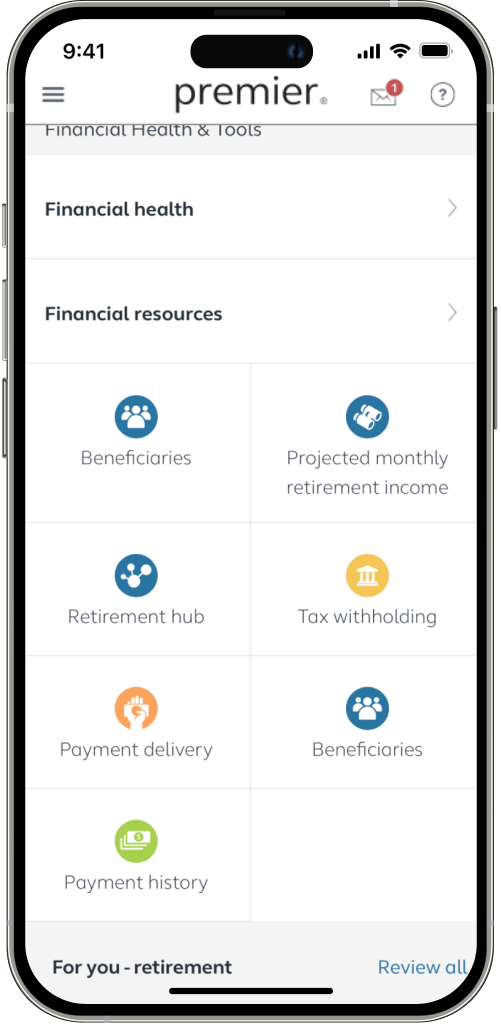
The AWLDS team established the foundations and basic components for web, but some elements were left undefined. Our goal was to close these gaps and create a mobile app that aligns with the AWLDS vision while addressing key issues to improve the user experience.

The Results
The enhancements made led to significant results across multiple areas
Following the launch of the new version, improvements in user experience, app performance, and targeted promotions have led the app to achieve:
~2M
downloads in the App and Play Store
~1/2M
monthly active users
200%
increase in the use of the app
4.8
star rating, up from 2.3 in the previous version
But... how did I contribute to achieving these results?
Thrive to AWLDS
I did a component audit to get familiarized with AWLDS, understand its values, and indentify which areas needed to be worked
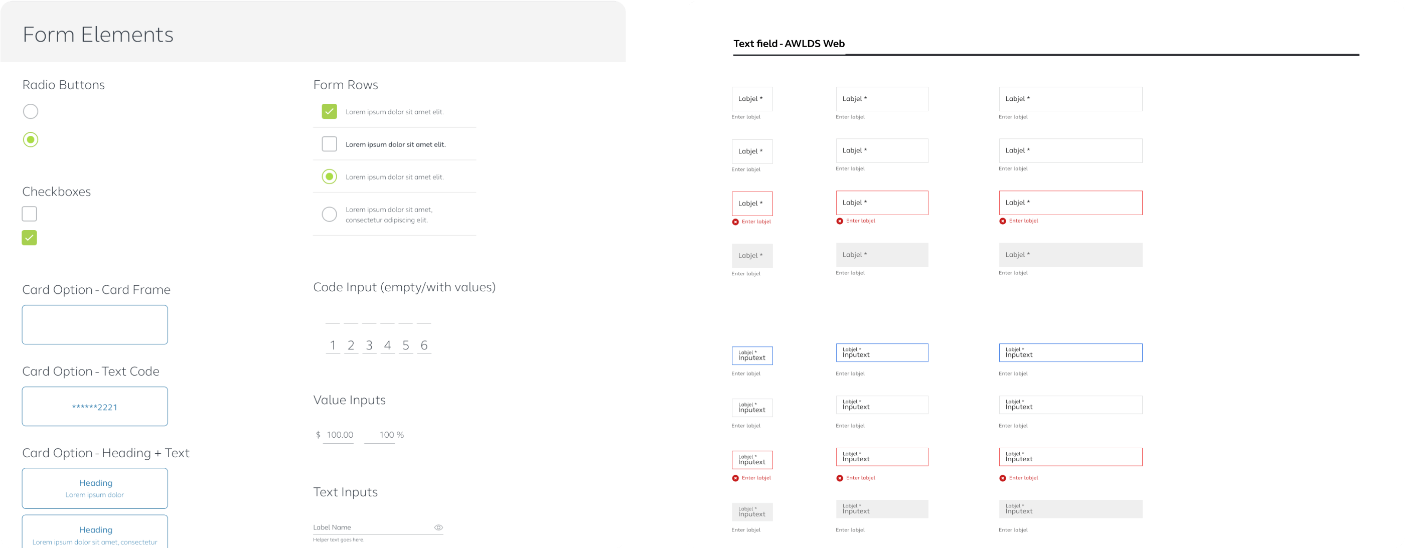
I started by familiarizing myself with AWLDS. Through a component audit, I compared the current app's components with their AWLDS web counterparts, identifying translation patterns, issues, and components that lacked equivalents and needed to be created.
Explorations
After identifying the missing components, I began exploring their transition to AWLDS, holding regular design reviews with the design system team to ensure alignment with the overall vision
I explored various design options based on my interpretation of the system and available references. Starting with small changes,
I then developed alternatives more aligned with the new system’s vision, even if they represented major shifts. By reviewing components
in context rather than isolation, I ensured harmony and consistency.
Once I selected the best options, they were presented to the team for evaluation, final selection, or
further iteration before handing them off to the developers.
Major Changes
Despite the constraint against major component changes, some required adjustments to enhance the overall experience, and I successfully secured exceptions
To enhance the mobile app experience, I made some significant component changes. Some were easily approved with our rationale, others
required testing and data to prove their value, while a few were denied.
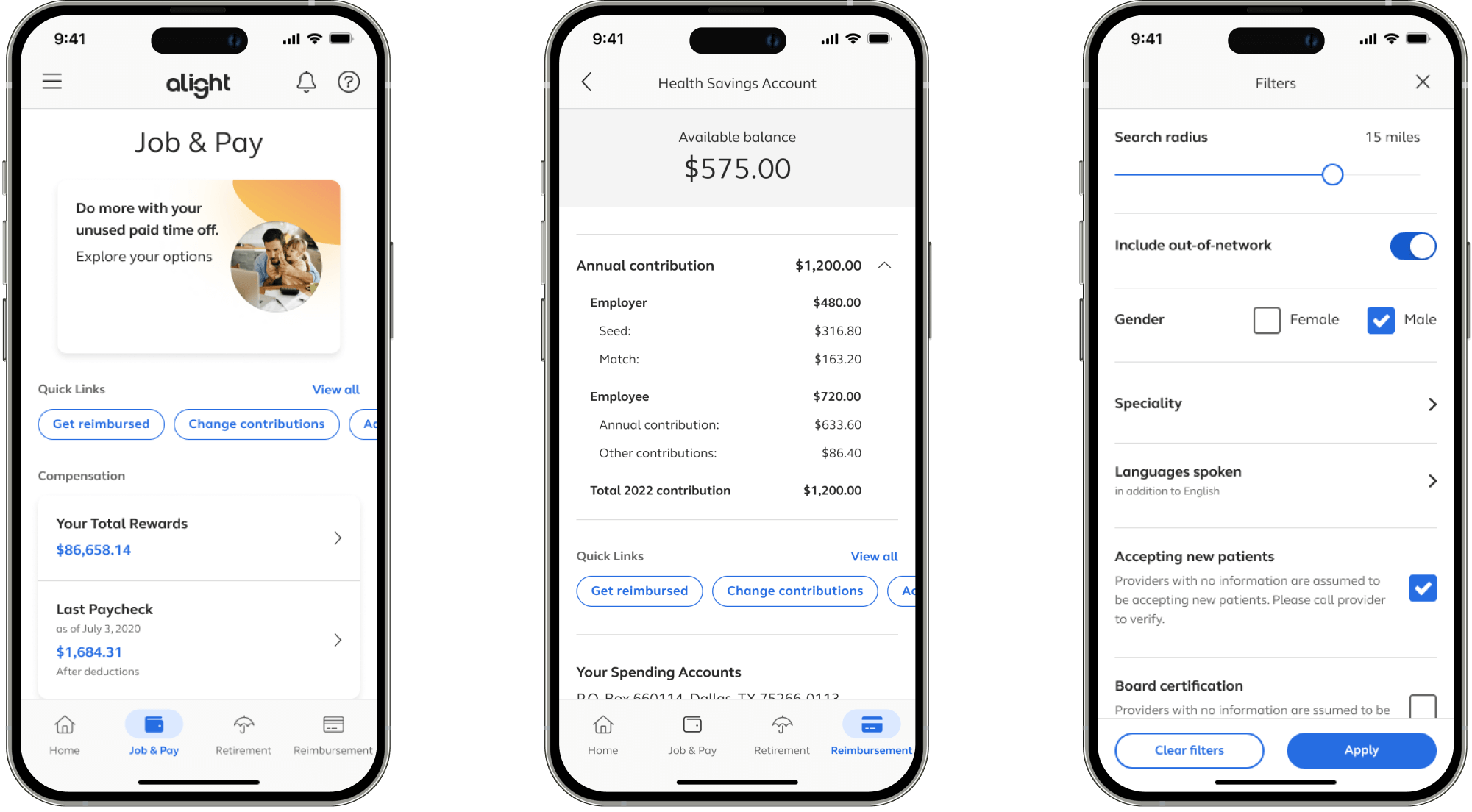
One successful approval, after demonstrating its effectiveness, was the quick links.
The quick links section could become too large, making some content harder to access
On landing and deeper pages, the full quick links list is displayed. Depending on the page and client, this section can be too large, sometimes offering little value and pushing content down, making it harder to reach.
After two rounds of testing, I arrived at a solution
To save space, I replaced quick link cards with horizontal chips and conducted usability testing on this approach.
The first round of testing was generally positive, but about 35% of users didn’t notice they could scroll when the chips fit perfectly on the screen.
This challenge was complex due to the variability in chip length and device screen size.
I explored multiple solutions, and decided to address this by adding an animation during loading to visually cue users that the section was scrollable.
The second round of testing showed a reduction in users who missed the horizontal scroll feature.
Accessibility
Along with transitioning the app to AWLDS, I collaborated with multiple teams to address existing accessibility issues
Accessibility became a core value of AWLDS. Fortunately, there were already efforts in place to identify and resolve accessibility issues.
These efforts focused on two main areas: the level access list and dynamic typography.
The app was audited by a11y experts, and I made fixes based on their findings
The experts gave us a list of violations and recommendations.
I prioritized these issues by severity and addressed them with our a11y team.
One complex issue was the 401(k) graph, which lacked alt text. Given the difficulty of
conveying all chart data through alt text, I added a table view that describes the
information, making this information accessible to screen readers.
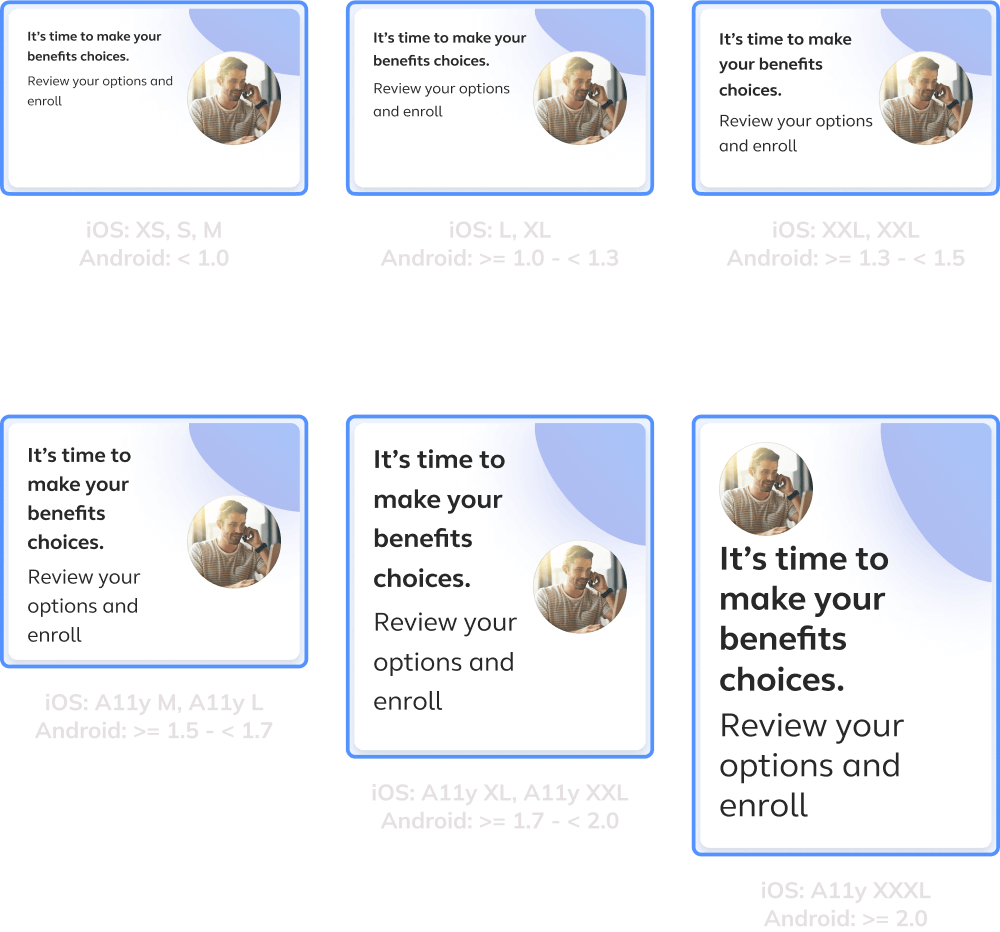
Through research and collaboration with the dev team, I defined sizes and behavior for dynamic typography
Few apps support dynamic typography, but by reviewing and testing the available ones, I identified how it works
and common practices.
Since supporting all levels required extensive testing, which the dev team couldn't manage at the time, I grouped some
levels to use the same behavior to balance the user experience and dev effort.
Final Steps
With the final components complete, I shared key templates with the dev team, established design guidelines, and became the primary reviewer and support resource for app projects
Many app screens shared similar layouts but with different content. By providing the dev team with key templates, they could migrate the entire
app without needing mockups for every screen available. For screens that didn't fit a template, the design team created them.
Some key flows were going to be updated using the new design language before and after the app's update launch. To ensure consistency, I created design
guidelines for AWLDS focused on the app, and I reviewed and approved new designs to ensure they aligned with the app's standards.
What I Learned
The importance of having constant communication across teams
- Constant communication between AWLDS, PMs, Devs, and A11y ensured we stayed on track and avoided wasting time on misaligned work.
- Having well-defined foundations and references provided us with a clear direction, making it easier to align our work with the overall vision.
- Some information, like dynamic typography on the design side, remains hard to find, requiring extensive research and some personal interpretation.