
Develop for Good
My role
UX Designer
Duration
3 months
Tools
Figma
Miro
Team
1 Industry Mentor
1 Product Manager
4 UX Designers
What is Develop for Good?
An organization accelerating digital transformation in nonprofits and empowering the next generation of tech leaders
DFG connects nonprofits with students and industry mentors to create impactful projects, offering real-world experience to volunteers and fostering valuable relationships.

The Problem
DFG's website is underperforming in attracting applications and frequently receives questions about information already available online
DFG receives hundreds of applications each cycle but falls short of expectations given the interest. The website suffers from a high bounce rate, low return visitor numbers, and many application drop-offs.
Who are we designing for?
Based on our initial website analysis and client meetings, we identified three key user groups

Students
University students interested in social impact and volunteering

Industry Professionals
Professionals interested in mentoring students in their fields

Nonprofits
Organizations seeking services at a reduced cost
User Interviews
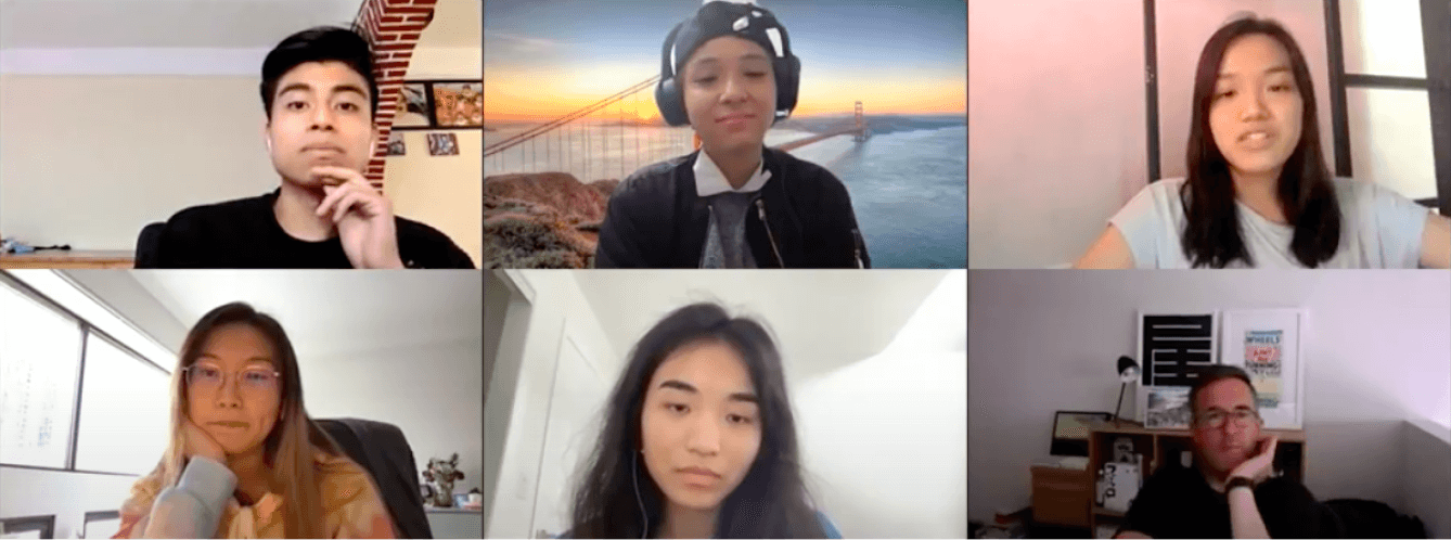
To understand user goals and challenges with the website, we conducted interviews with the different user types
We divided the team to focus on a specific user group. I focused on students, gaining insights into their application journey, goals, frustrations, and the information they need to decide on joining DFG.
Key Findings
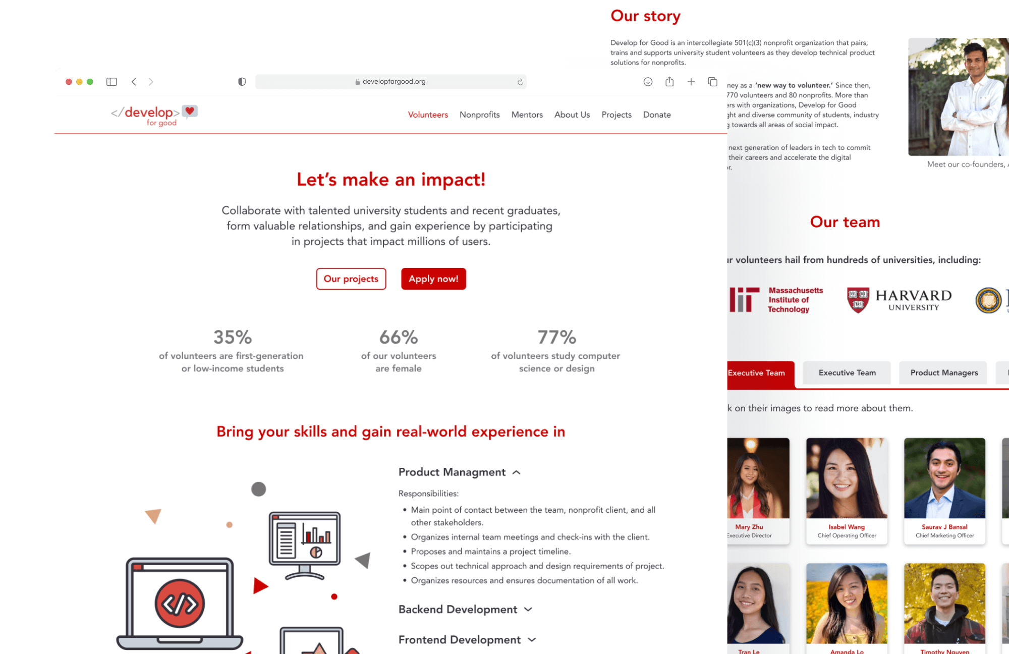
Most goals and issues were common among users, so we prioritize two key areas that would most impact the experience and business goals
After the interviews, the sub-teams shared their insights, uncovering similar goals, experiences, and issues among users. In a workshop, we grouped common issues, evaluated their urgency and impact, and prioritized those most critical to users and business needs given the project deadline.
🚀
Navigation
Users faced difficulties navigating the website, finding information, and encountered unexpected behaviors
📃
Content
The website was overwhelming, with unclear messaging and disorganized sections
The Solution
Restructure the website to streamline access to essential information
The problems users faced in finding information led to doubts about applying due to confusion, lost interest, and concerns about the association's reliability. By revamping the website’s structure and pages, we are tackling these core issues that hindered the achievement of users and business goals.
Navigation
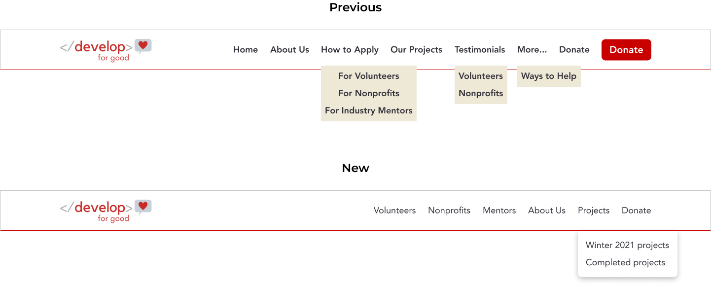
Using the audience as the organizing principle, and considering common information and business priorities, we defined our main navigation categories
Our research found that the previous navigation was confusing, misaligned with user expectations, and had unclear labels that complicated information retrieval. To address this, we’ve provided direct access to relevant content for each user type and included links to current and past projects, which are important to all users. We’ve also balanced user and business needs by featuring only top business priorities, such as donations and showcasing the association, in the main navigation.
The Skeleton
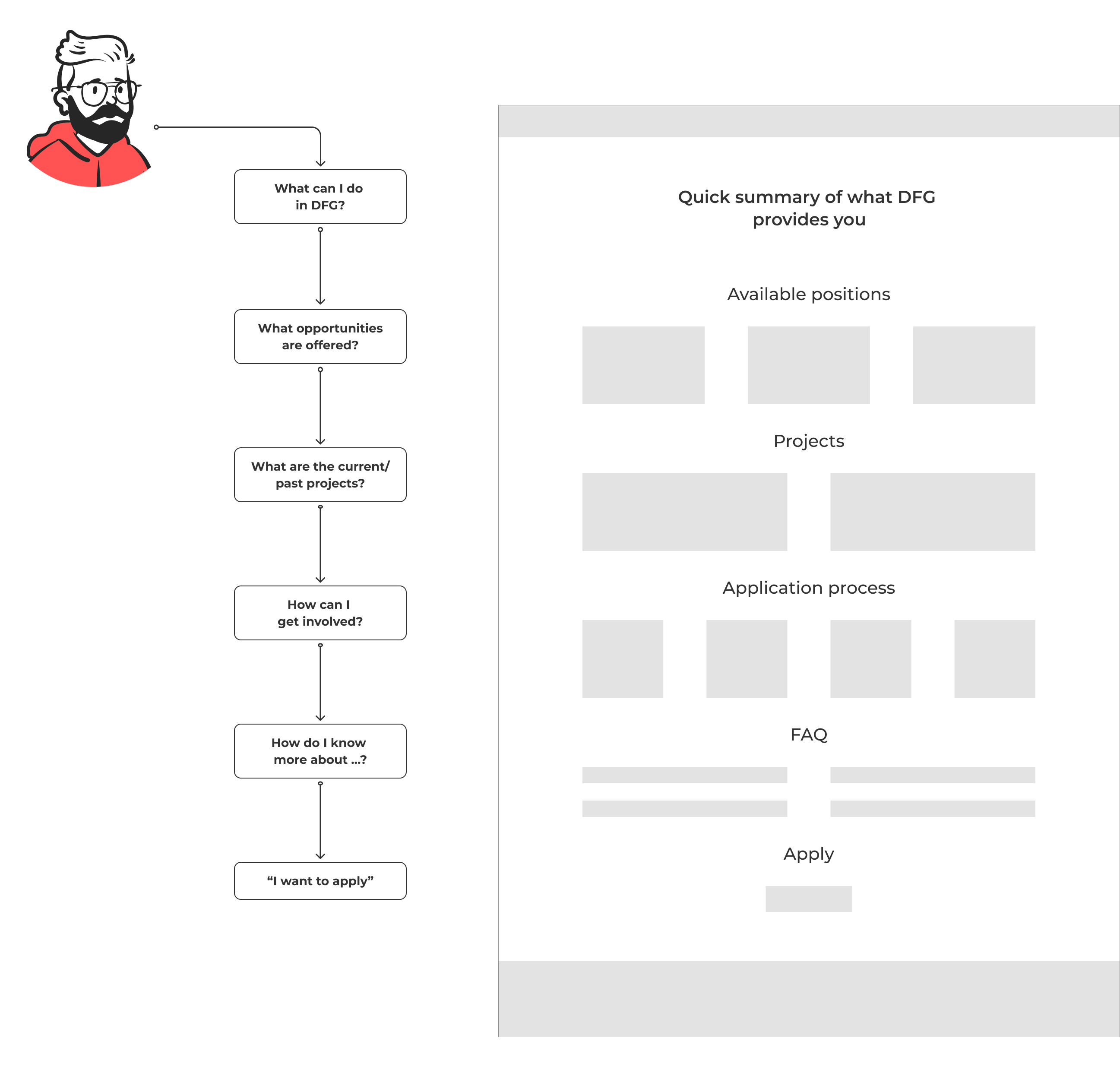
To shape the information and page structure, we based our approach on the user journey from arriving at the website to deciding to apply, addressing the questions they had at each stage
Content Writing
One of the biggest challenges was phrasing the information effectively. Through multiple iterations and feedback rounds, we refined the content to meet both user and client needs
Content writing wasn’t a team strength, and initial drafts were often unclear or misaligned with client needs. After several proposals, feedback rounds with the client and users, we developed clear, direct content that accurately reflected DFG's message.
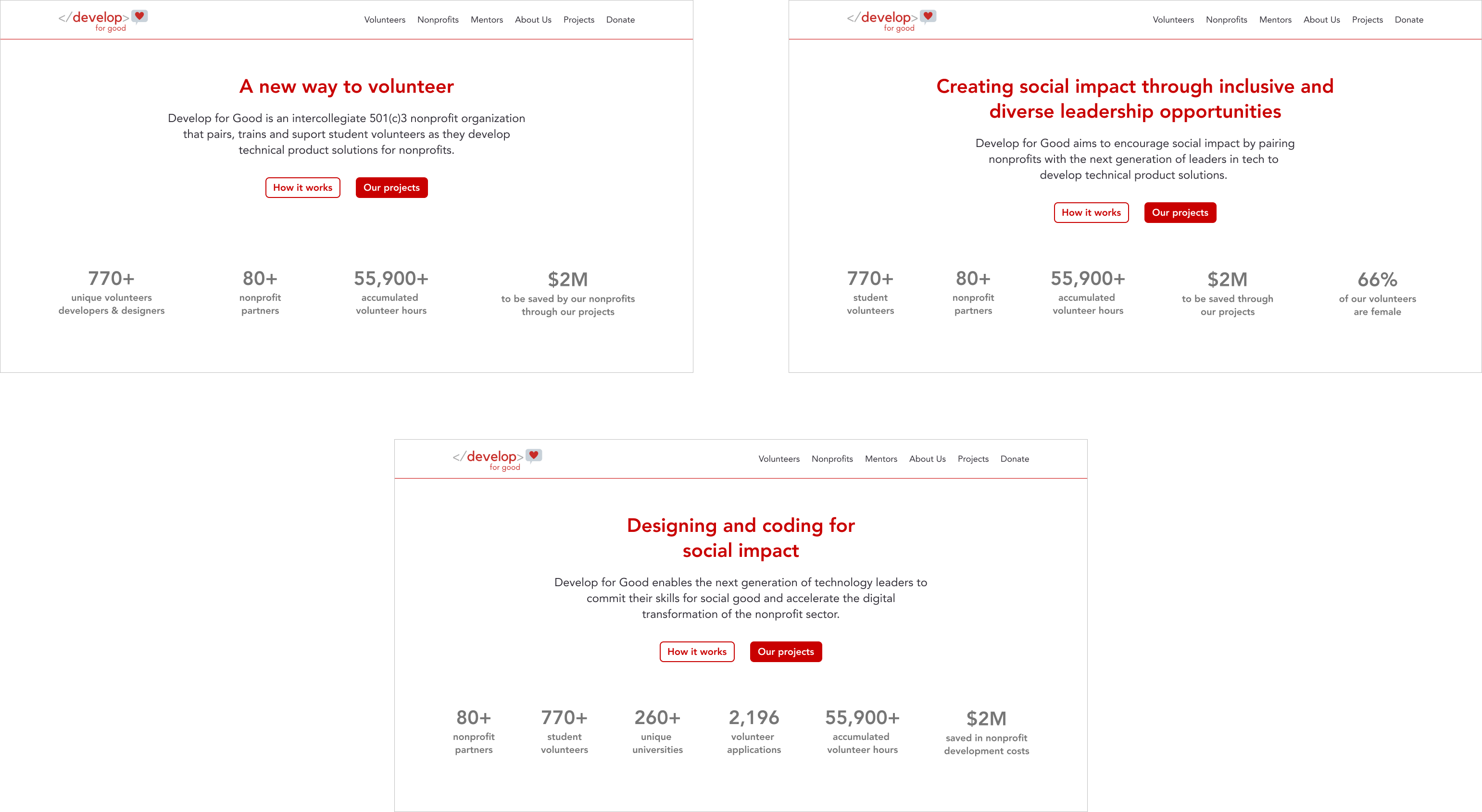
Accessibility
Aligned with DFG's principle of inclusivity, we focused on creating an accessible website
The previous website had significant accessibility issues, notably poor text-background contrast. I ensured our components met the basic accessibility standards such as using colors with a minimum AA contrast ratio, providing alt text for images, and ensuring touch targets were at least 44x44 pixels.
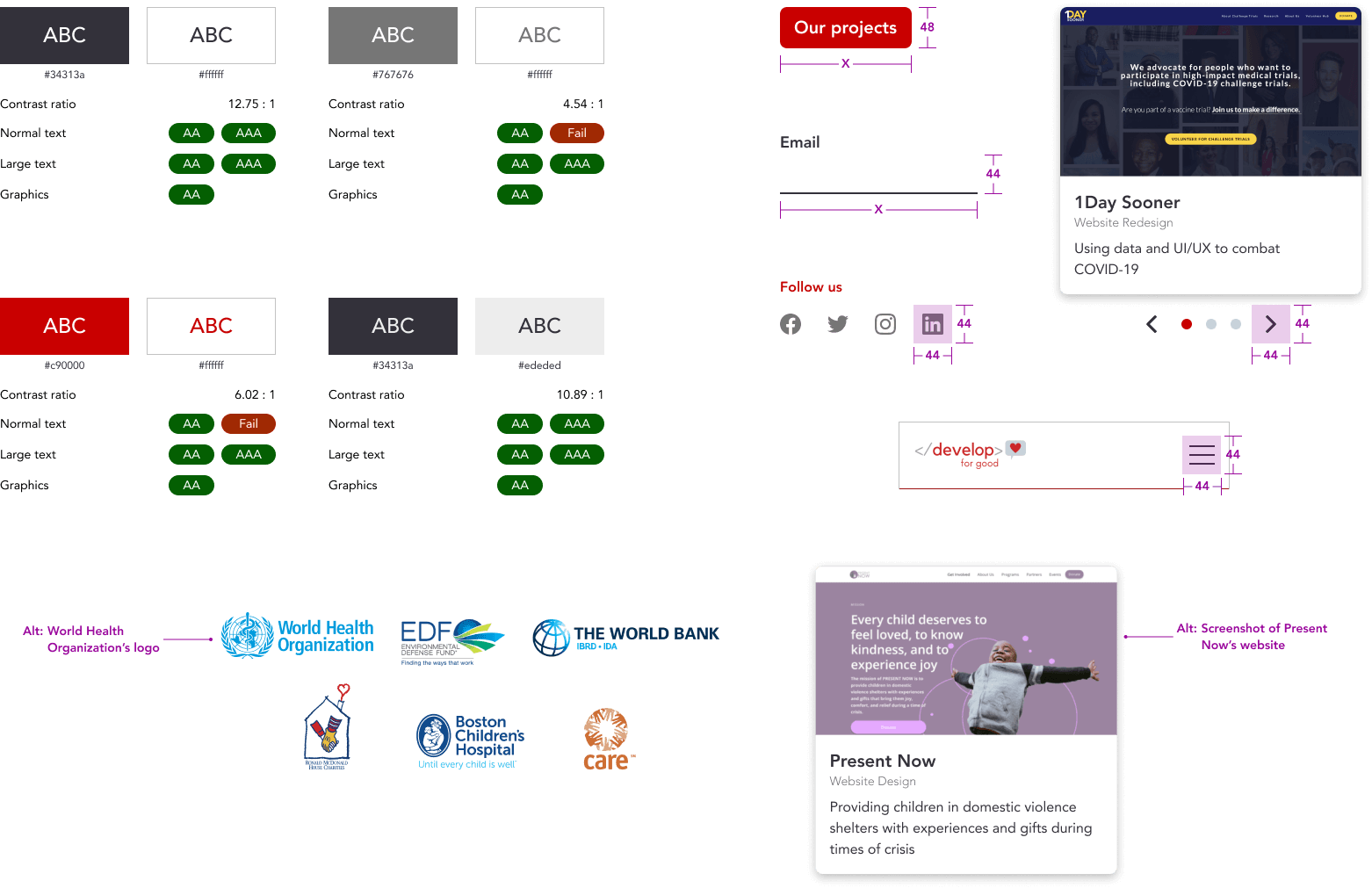
Final Design
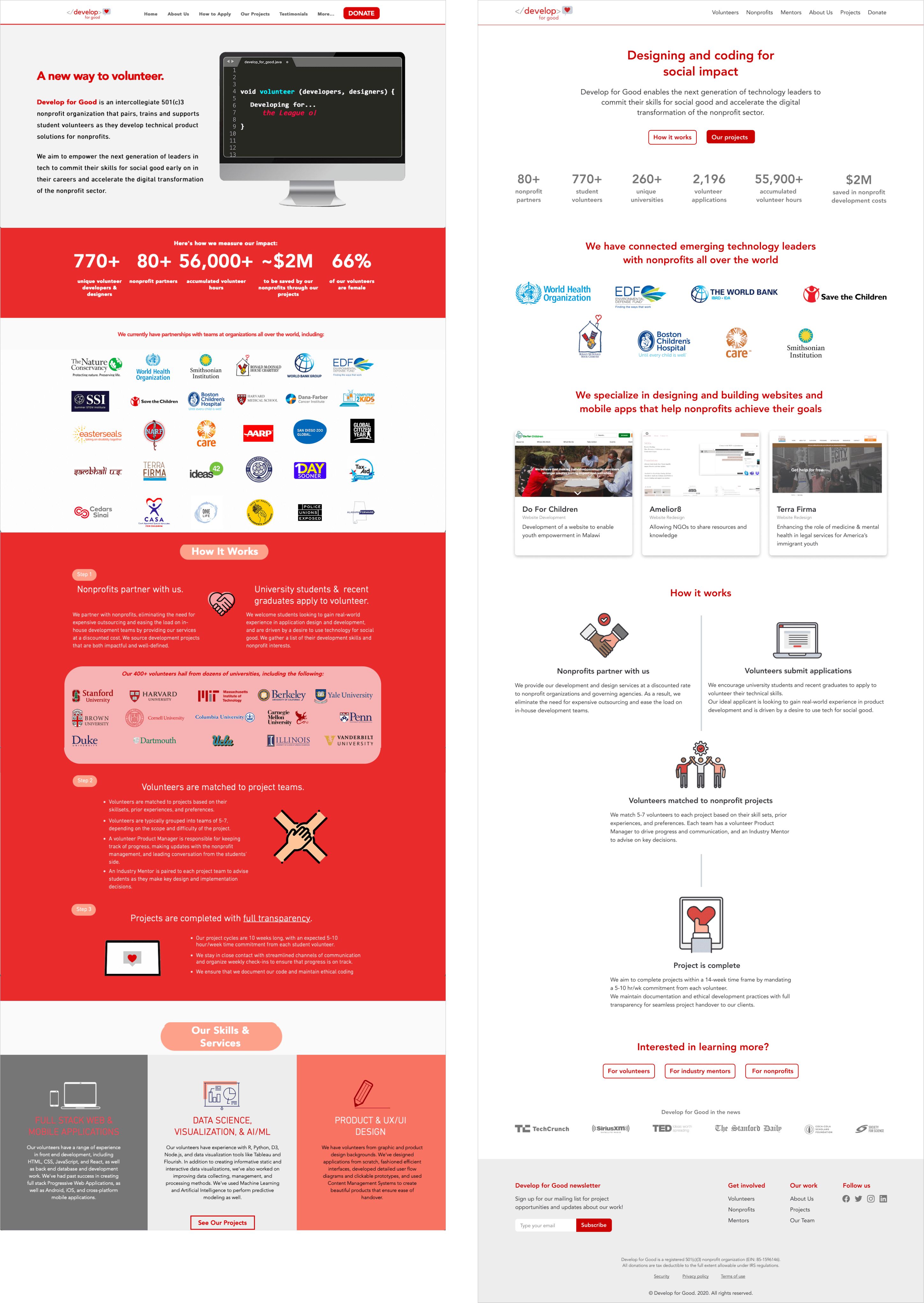
The home screen, an introduction to Develop for Good
The home screen addresses key questions: What? Where? and How?. It offers essential information relevant to all user groups without overwhelming them with unnecessary details at this stage.
Capturing the heart of the association
In the hero section, we present the association’s essentials and key calls to action
for all user groups, supported by the achievements to build trust.
Since applications are open only part of the year, the application notice is designed as a flexible banner
that can be toggled on or off, prominently displayed to capture attention.
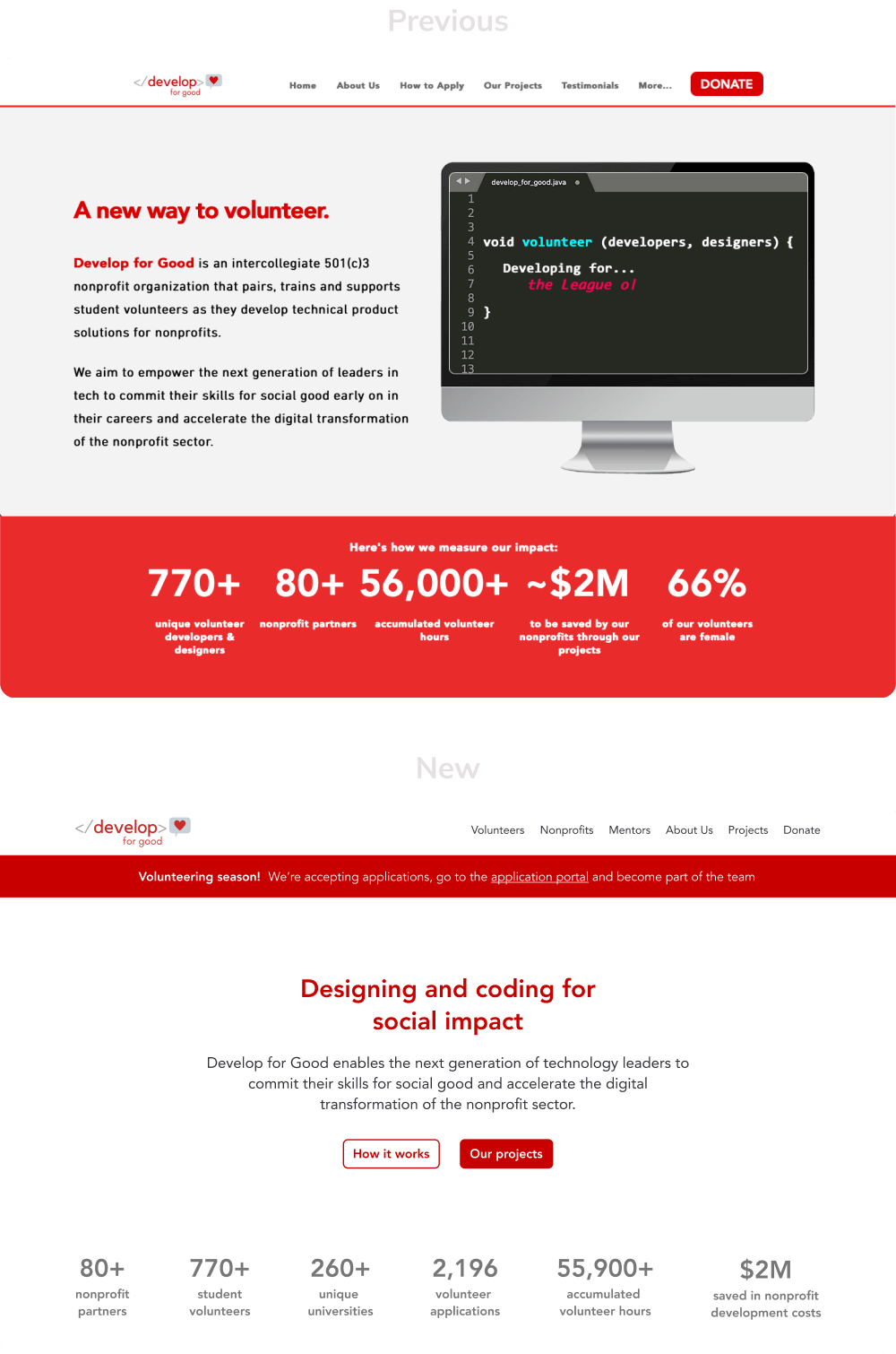
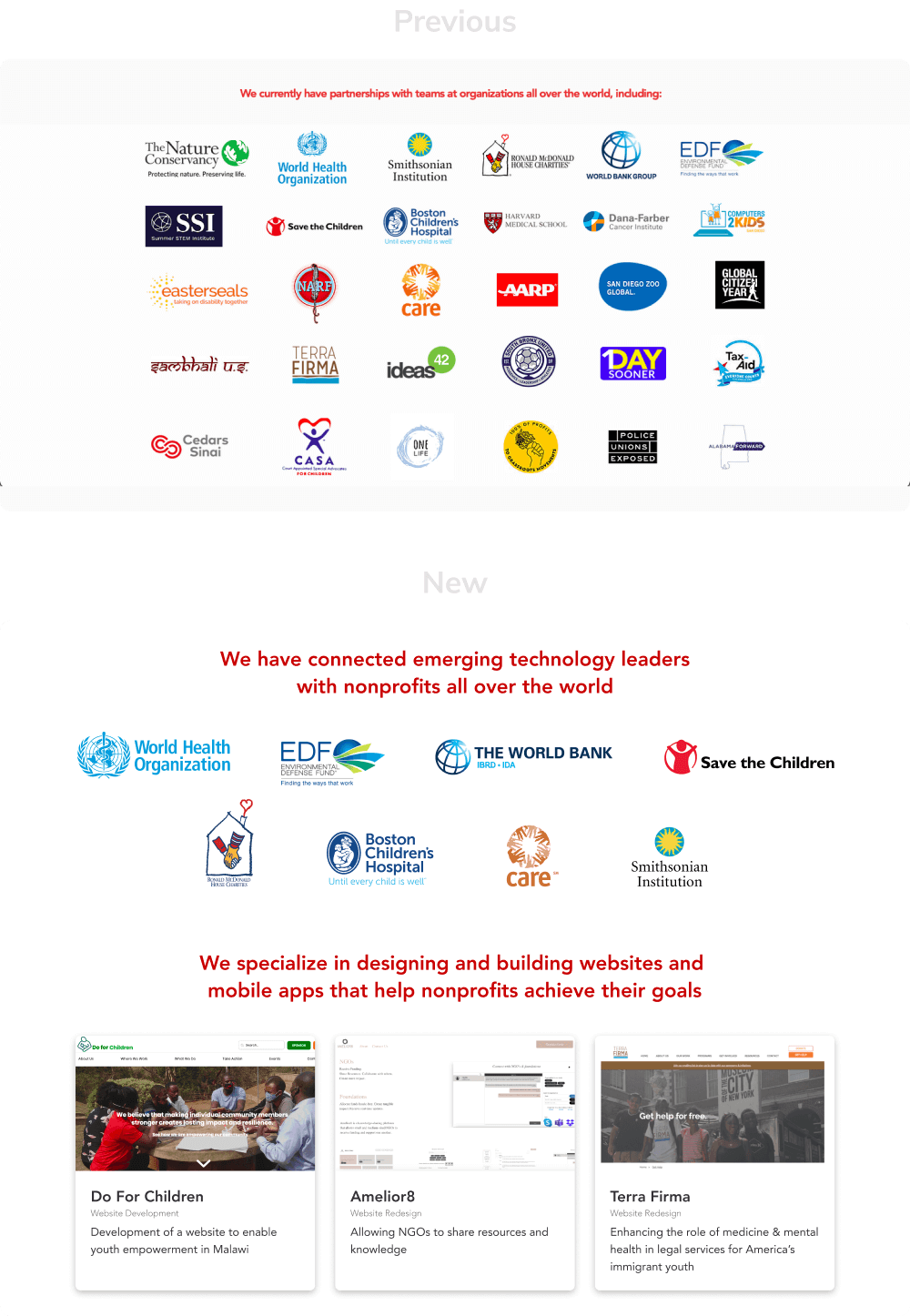
Demonstraiting the association's work
Client data showed that displaying partner logos attracted more users, but there were too many. We successfully convinced the client
to feature only the most relevant logos, reducing clutter without losing impact.
Additionally, once the association’s purpose was clear, view completed projects was essential for the user groups, so we added this previously missing information.
Showcasing the process
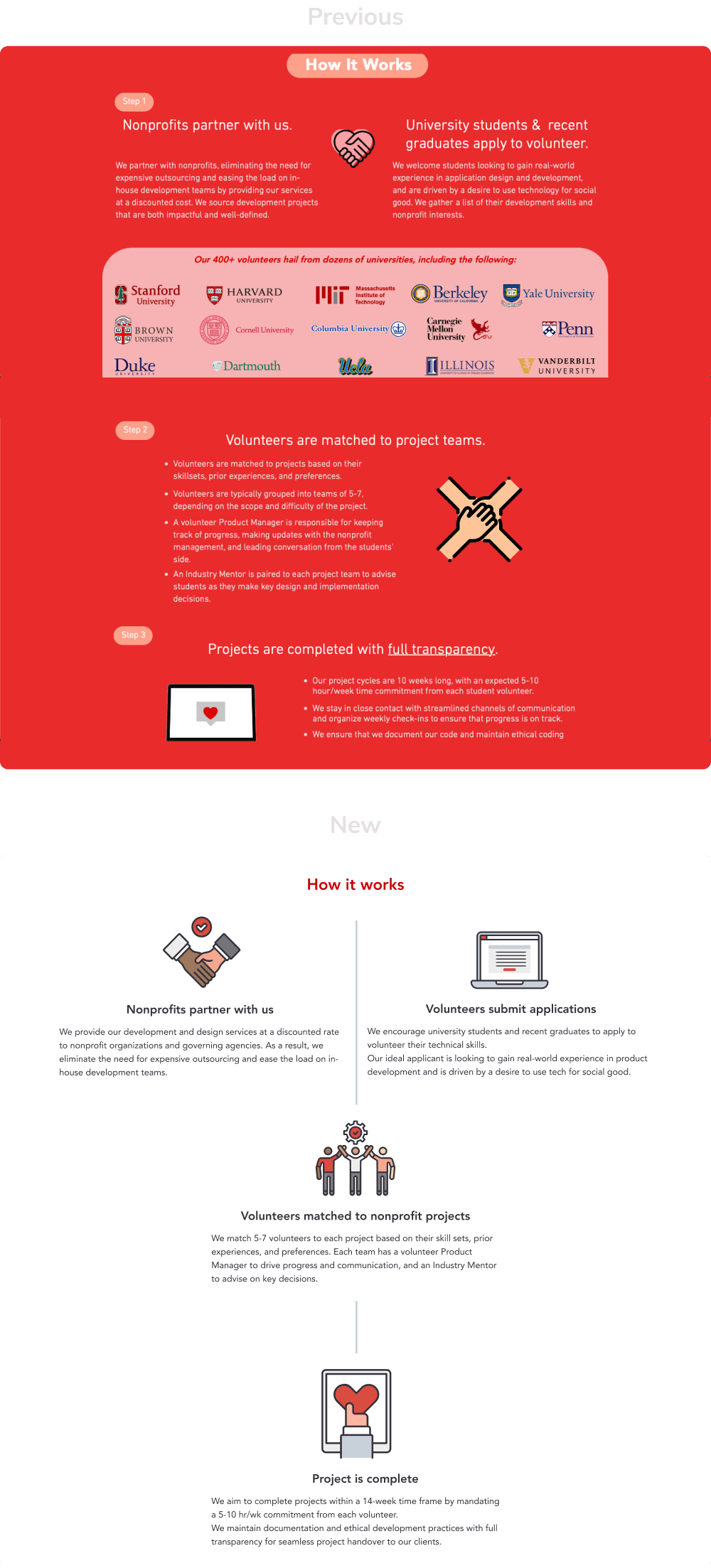
When users expressed interest in participating after learning about the association, they needed to understand the application process. We simplified the content to make it easier to grasp, clearly reflecting the general process applicable to all users.
Ending with an action
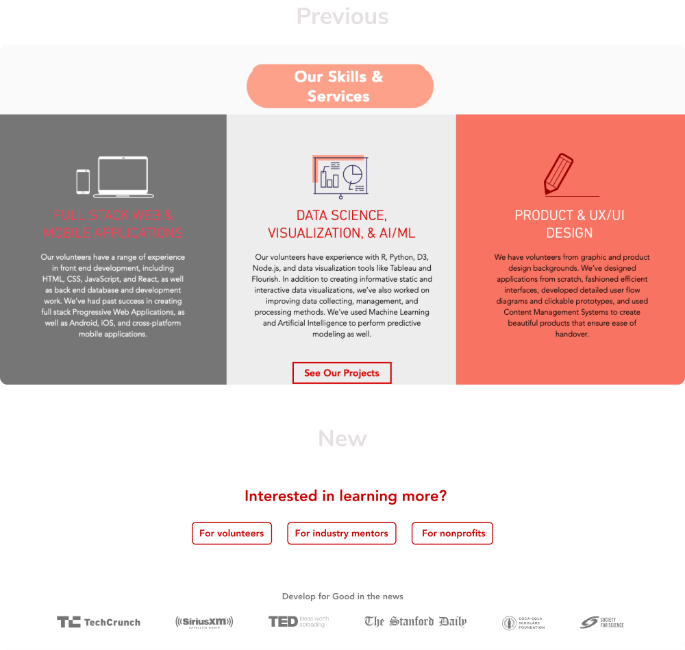
To keep the home screen general and relevant, we replaced the existing section with calls to action that guide each user group
to detailed, relevant screens to find more information.
Our client wanted to feature articles written about them, but this information was less relevant to users. We included it in a subtler section at the end,
ensuring it didn’t detract from the primary content.
Each page for volunteers, nonprofits, and mentors provides all relevant role-specific information
Role-specific pages guide users through learning about the association and deciding to apply, with each
section building on the last to encourage application.
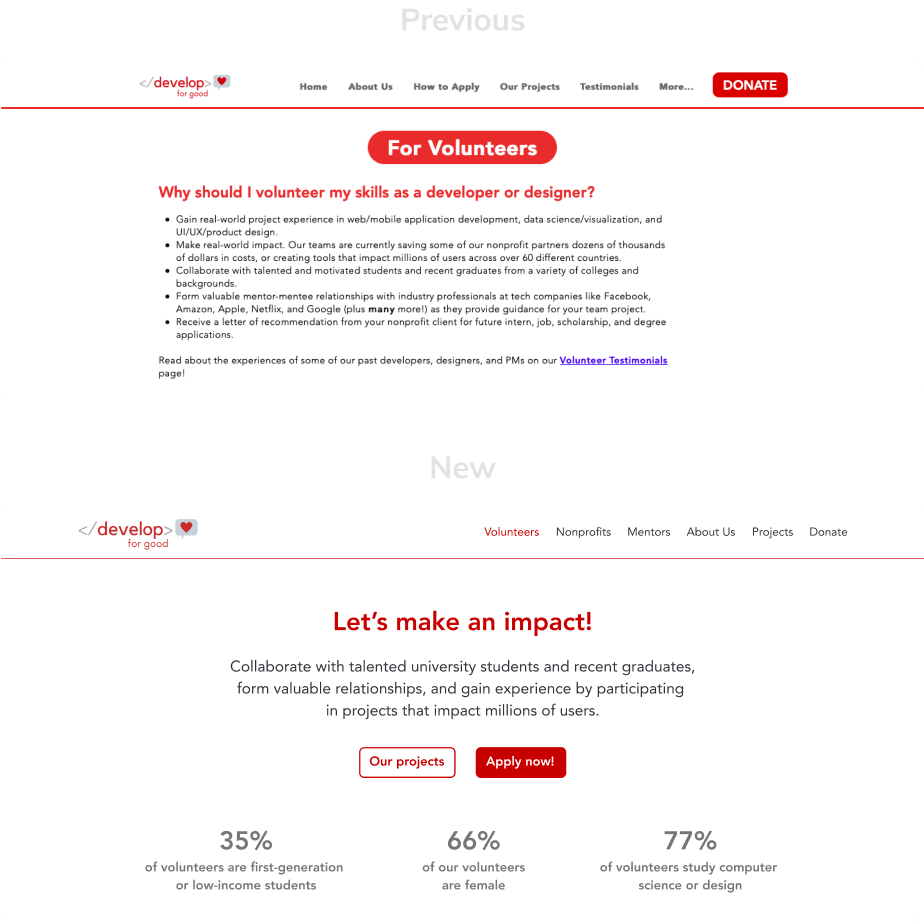
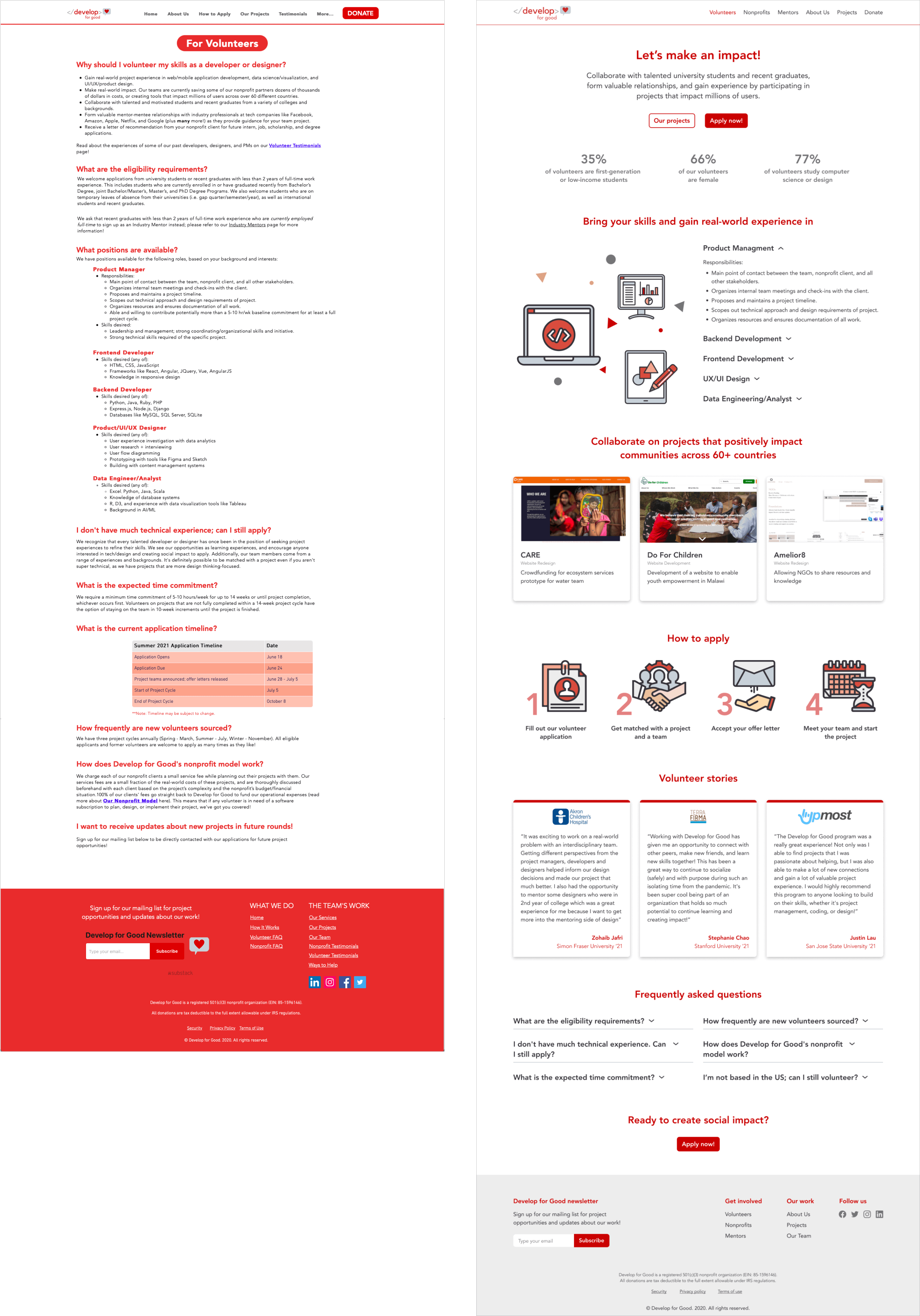
I designed the volunteers page, improving the experience based on insights gained throughout the process.
Capturing the volunteer's role in the association
In the hero section, we highlight the role’s impact with a concise, powerful message, complemented with key calls to action.
To showcase role-specific achievements, a priority for the business, we adapted the home screen's pattern while updating the content.
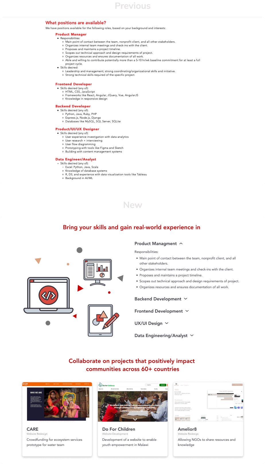
Showcasing the positions and projects available
When users understood their role and showed interest, they needed to find out how and where to participate.
We used accordions to display position descriptions, allowing users to view and select only the information relevant to their interests.
Additionally, we highlighted past projects to illustrate what they can achieve and where.
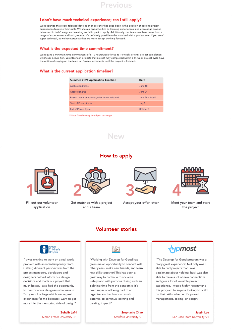
Explaining the process
Once users decided to apply, they needed a clear understanding of the process. We streamlined this
section for clarity and include the project timeline when applications are open.
Although testimonials were not crucial based on our research, the client was keen to feature them, we included them under the
process section to provide a final reassurance for users who may be hesitant.
Providing the final tools to apply
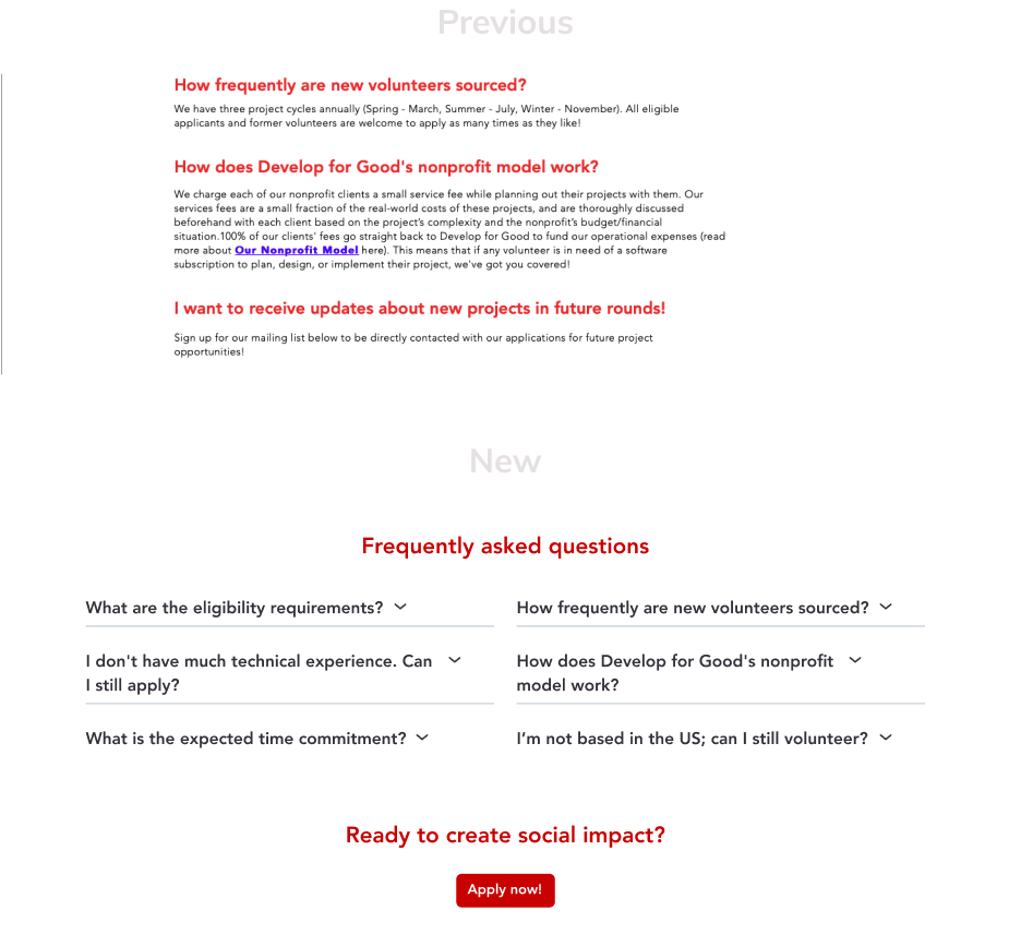
Since the redesign prioritized essential information at each stage, and some information was removed from the original design,
we added an FAQ section at the end to address any remaining details.
Finally, after presenting all the information the uer needed before applying, a call to action to apply is provided to conclude the page.
Results
The association successfully increased applications and participation in subsequent project cycles
Alongside the website, the application portal was also updated, though only minor changes were made due to the
association's priorities, focusing on key aspects.
Following the website launch, the association achieved the following in the next two cycles (6 months):
15
new non-profit partners, breaking a long-standing stagnation without new partners
300
accepted volunteers, compared to an average of 100 per cycle in previous ones
What I Learned
Divide and conquer
- It was a lengthy project, and keeping everyone engaged was challenging. When team members were not fully committed, it impacted our work and results. We needed to foster a positive environment and align tasks with each member’s goals.
- Our initial plan included usability testing of the final design, but delays prevented us from completing it. We should have incorporated testing earlier or reduced time on some tasks to allow time for testing, get valuable feedback from users and make adjustments.
- Working closely with the DFG executive team was a valuable experience. I learned that design must align with client needs as well as user needs and that it's important to choose your battles wisely.