
Alight Mobile Design System
My role
Product Designer
Duration
4 months
Tools
Figma
Zeroheight
Team
1 Product Designer
1 A11Y Specialist
1 UX Researcher
What is AWLDS?
The primary guidelines for all of Alight's 90+ offerings
Before AWLDS, Alight's 90+ products had inconsistent designs, and developing components took too long. To address this, the design system team streamlined the process with a comprehensive design system.
The Problem
Currently, AWLDS covers only web platforms, with no mobile app guidelines integrated
The mobile app guidelines live in Figma, they're design-focused and sometimes lack detail. As AWLDS advances and the app's priority increases, integrating these guidelines into AWLDS is essential for a unified design system for the different teams and to minimize uncertainty in app design.
The Goal
Using AWLDS for web as reference, develop the app's design system foundations, aiming for a stakeholder demo in the short term and full system reference in the long term
To develop the app’s design system, we first need to demonstrate its value to stakeholders to secure the budget. The initial demo will showcase the foundations, helping us obtain funding to fully migrate our guidelines from Figma to Zeroheight, develop a full design system and integrate it into the AWLDS framework to obtain all its benefits.

The Result
Established a solid foundation with design tokens and a defined methodology for component creation and documentation, setting new standards for consistency and scalability.
The project's results will prevent repeating issues seen in the web design system, leading to an improved experience for users. The success of these new standards will serve as a foundation for adopting these guidelines across the company’s main design system.
~50%
reduction in average time required to create and document components
35%
decrease in reported bugs tied to component functionality and documentation gaps
🧩
Design tokens
Design tokens were defined, adapted, and synchronized from Figma to code, enabling their use in app component development
But... how did I contribute to achieving these results?
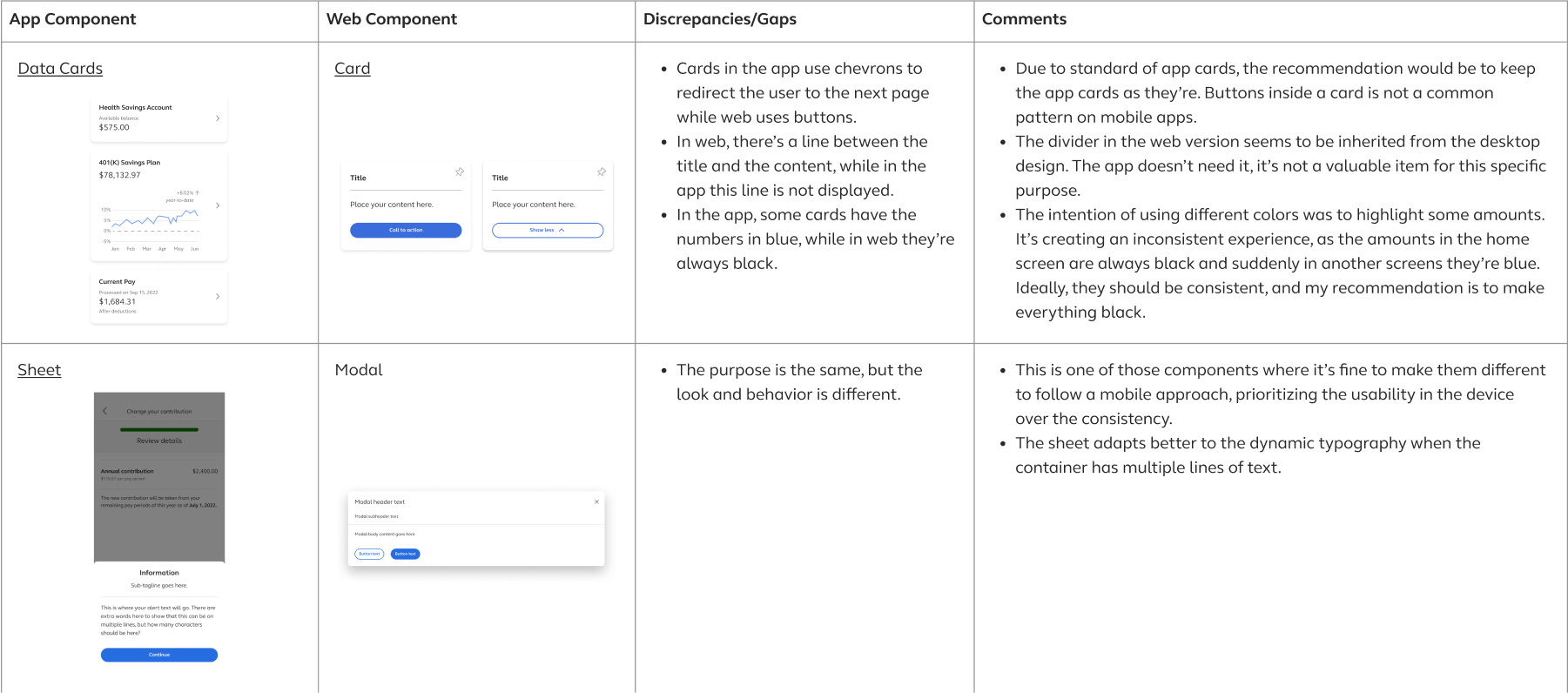
Component Audit
When the mobile app transitioned to AWLDS, the web design system was less mature. I conducted a component audit to identify gaps between the app and web components.
The web design system has seen significant progress and is where most of the effort has been concentrated.
When the app migrated to AWLDS, it used the initial version of the system. Since then, many improvements have
been made, but the app has not been updated to reflect these changes.
To align the app with the latest AWLDS standards and ensure a consistent cross-platform experience, I conducted
an audit to identify gaps and where exceptions were needed to prioritize mobile usability.
User Interviews
I partnered with the research team to conduct interviews and gain insights into designers' needs and their experience with the current library and guidelines.
Six designers were interviewed, grouped by their familiarity with the Mobile App Library: slightly, moderately, and highly familiar.
The goal was to understand their needs, challenges, and gather insights on file structure, component organization, and guideline clarity.
Key findings:
- Section titles were unclear, forcing designers to explore them to understand the content.
- Some component guidelines were detailed and useful, while others lacked sufficient information.
- Shared components like buttons and checkboxes were difficult to differentiate between web and app.
- Having all references in one place was crucial for easily accessing app flows and finding inspiration.
Though the web design system wasn’t the main focus of the research, designers provided valuable feedback that
could be considered for the app design system.
Key findings:
- Inconsistencies between the library, guidelines, and code caused usability issues.
- Certain components didn’t function properly in specific scenarios, requiring designers to fix them manually.
- Important sections were missing from the guidelines of some components.
- Labels and comments on components in progress were often missed, leading to their use in final designs.
Strategy
Based on the collected information, I defined which areas and aspects to focus on
Using interview results and product objectives, I identified key areas to address in order to achieve the overall goal and enhance the current experience.
⚒️
Work Process
Establish a process for creating and documenting components.
❖
Library
Create a well-organized library with clear sections that include all the app's components.
📖
Documentation
Ensure all component documentation is consistent and addresses user needs.
Work Process
Since the design system team had a well-defined documentation process that worked well, I focused on establishing the component creation process
My goal was to establish a process for creating and adding new components to the mobile app library. This aimed to have a clear path to follow, prevent in-progress work from appearing in the main file and reduce the chances of publishing components with errors.
Taking advantage of branching in Figma
- Create a branch with the naming convention [Jira Ticket] - [Component Name].
- For component updates, copy an instance of the current component and modify its properties, to then visualize how later on changes affect the current version.
- Build the component using defined variables, auto-layout, and properties with the established naming conventions.
- Test the component by modifying its width, height (if applicable), and property values. If possible, have designers test it as well.
- Add Victor Molina as reviewer.
- If no changes are needed, merge the branch into the main branch and publish it.
Library
For the library, I established guidelines for building components to ensure a consistent and optimal user experience
While the current app library components functioned well, they didn’t use the latest Figma features, such as properties, leading to inconsistencies in how web and app components operate. Additionally, research findings identified areas for improvement.
Two separate files were created to improve organization
Having the app's flows in one place was valuable but having it along with the components
added complexity to file management and maitenance.
To simplify, two files were created: one for the component library, containing all app components, and another
for the app flows, maintained through the team collaboration.
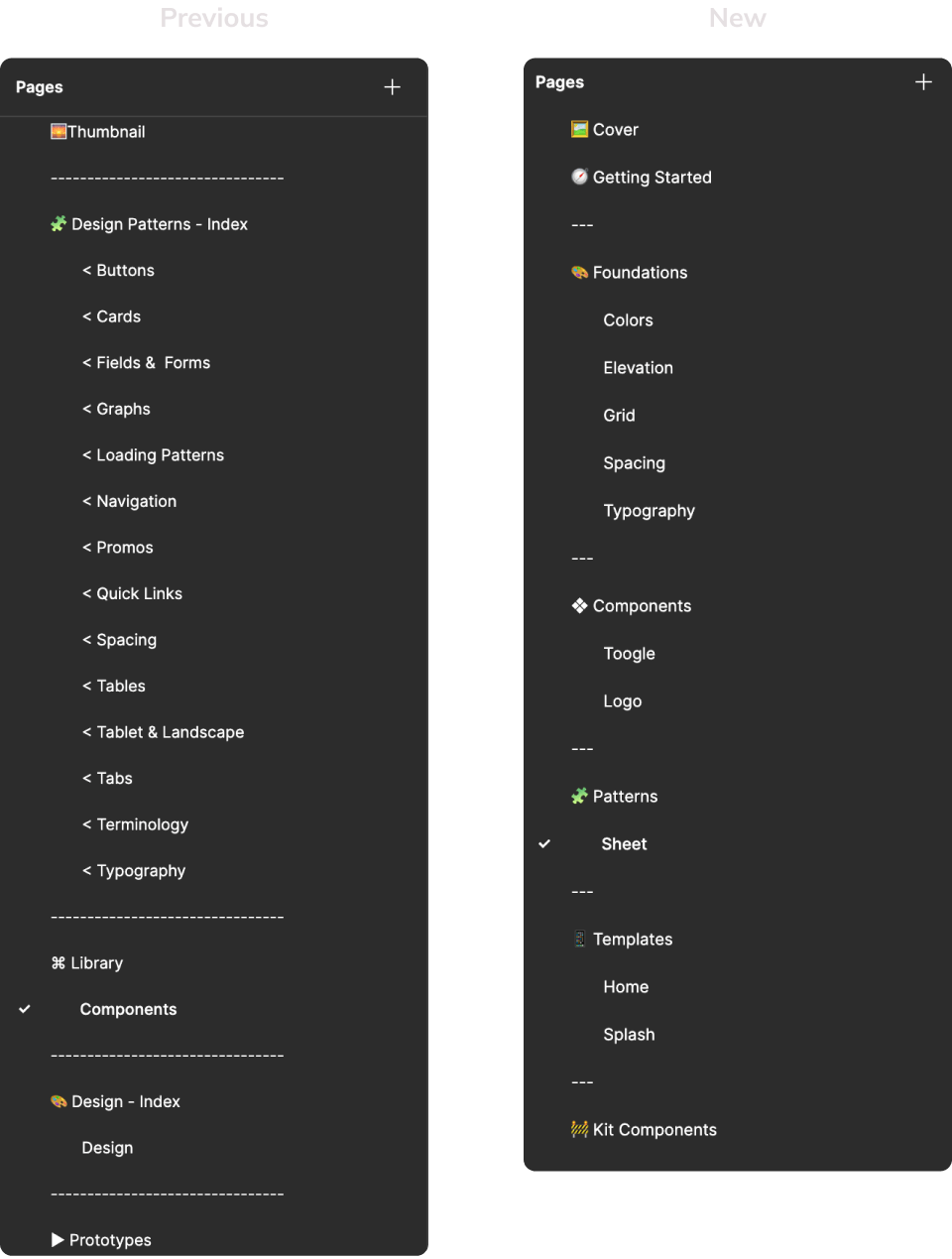
The file structure was simplified
With guidelines and flows moved out of the component library, the file became more
streamlined and allowed for better structure.
To maintain consistency with the web library, each component has its own page. Sections were added and
ordered from simple to complex, which designers noted improved component location. This setup
reflects the future organization of the documentation platform.
Only key elements were included on a page
I retained the effective component structure from the web library.
Designers valued having guidelines inside Figma, but to balance their confort with the library maintenance, we kept just key details,
such as properties, links, and management tips.
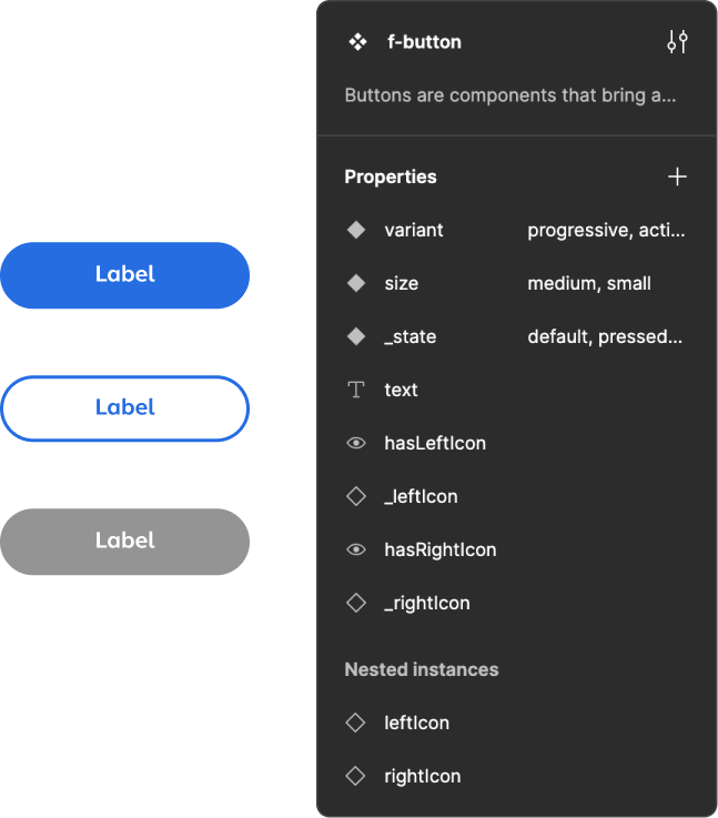
A defined naming convention
The web library's inconsistent naming caused confusion, so I established and documented standards to closely align Figma and code.
- All elements must use camelCase.
- Components follow the convention f-[componentName].
- Helper components follow the standard convention, but begin with a "." to prevent them from being published.
- Boolean properties begin with a verb like "is" or "has".
- Figma-only properties, like states, begin with a "_".
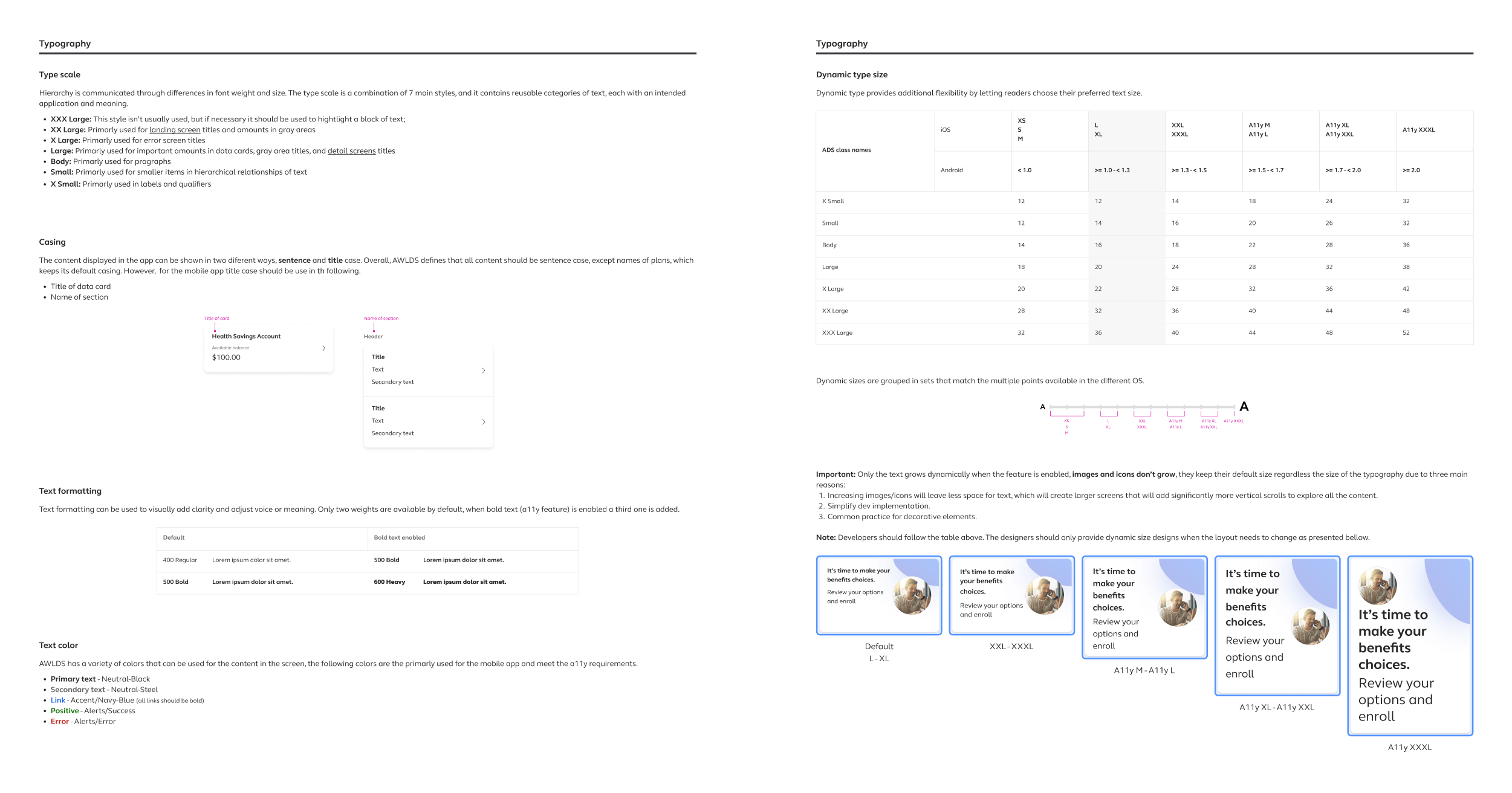
- Common property names and values, like variant, _state, size, and _breakpoint, were standardized to ensure consistency across all components.
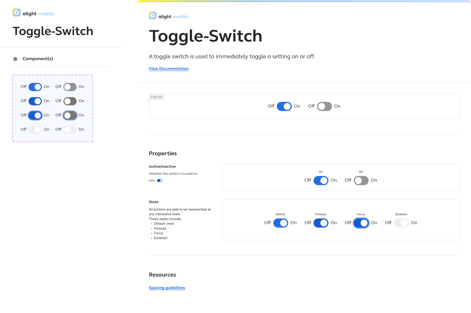
Component creation
In addition to using auto-layout, variables, and properties, I defined extra guidelines to enhance component usage.
- A property order was set for consistency: variant, size, state, breakpoint, followed by boolean, text, and instance swap. The last three are arranged by frequency of use, with the most common listed first.
- Place the most-used variant first (usually top-left) so it appears in the preview and is the default when designers select it.
- Apply the defined blue background color to the component set for clear differentiation between web and app components in the assets panel.
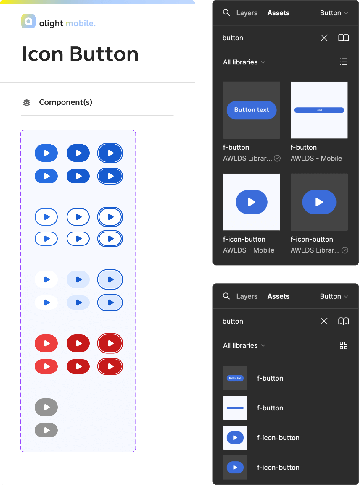
Documentation
One major issue with AWLDS was the inconsistent documentation. To prevent this in the app, clear guidelines and templates were established to ensure consistency
Both the app and web documentation had inconsistent guidelines, with missing sections in some components
causing frustration for the designers.
To address this, I analyzed both the web and app guidelines. The research findings complemented this
analysis, leading to the creation of a template that outlines the mandatory sections for documentation,
ensuring consistency before it gets published.
Final Steps
Once the standards were set, we built the foundations and basic components
Our goal was to create a demo featuring the foundational elements to present to stakeholders, secure approval, and then complete the full design system. The leadership team outlined the items required for the demo, guiding our focus on what needed to be built.
What I Learned
Documenting standards and processes makes a project scalable and prevents future issues
- As the design system team grew, inconsistent practices emerged due to varying interpretations of the practices. To address this, I defined and documented clear standards, created templates where needed, and made them accessible to ensure consistency and minimize future issues.
- Ongoing feedback and timely action are essential for creating a great product and ensuring user satisfaction. The initial version of the app remained unchanged for too long, resulting in unresolved issues that could have been addressed sooner to prevent bigger problems.
- Demonstrating value through actions and results, rather than just words, significantly increases the chances of achieving a goal.