
Wellbeing Assessment
My role
Product Designer
Duration
3 months
Tools
Figma
Miro
Team
1 Product Design Lead
2 Product Designers
1 UX Researcher
1 Content Writer
1 Product Manager
What is the Wellbeing Assessment?
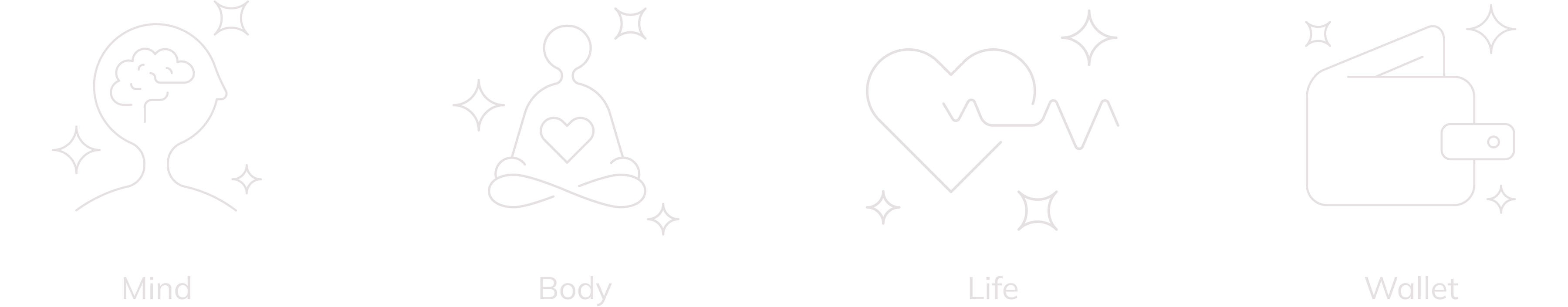
A four-pillar questionnaire designed to tailor the Alight Worklife experience to users' needs
The Wellbeing Assessment covers Mind, Body, Wallet, and Life, personalizing the platform based on responses to offer tailored content, recommendations, and action items for better work-life balance over time.
The Problem
The assessment intended to collect user data is lengthy and asks for personal information, raising the risk of user drop-off
Gathering all this data is crucial for the algorithm to deliver a more personalized and engaging experience, which enhances user satisfaction, and potentially attracts new clients. However, given the nature of the questions, it's likely that a significant percentage of users might not complete the assessment.
The Result
Designed an assessment that boosts full or near-full completion and was chosen for client attraction meetings to highlight our consumer-grade design and critical thinking
Unfortunately, the project was deprioritized and not launched. However, testing results indicated that users were
willing to complete it, and we felt confident that it would have successfully met business expectations.
The design process for this project had a significant positive impact on the design department, leading to its
selection for showcase meetings with potential clients, highlighting the quality of work our team produces.
But... how did I contribute to achieving these results?
Strategy
Early in the process, I noticed that designing a form could be messy, so I proposed a time-saving strategy based on four key pillars
Since the assessment content was already defined by the business, the plan was to integrate each section sequentially into a draft. However, early on, I identified issues with some
questions and the overall structure. If we continued with the original plan, similar problems would likely arise as we progressed, leading to repeated discussions
with stakeholders and revisiting approved mockups, ultimately wasting time.
Building on Forms that Work by C. Jarrett and G. Gaffney, I proposed a new approach to the team, outlining a plan based on four key pillars and
clearly explaining the goals and tasks for each stage.
🤝
Relationship
Encouraging people to participate and asking the right information
💬
Conversation
Simplifying questions, writing clear instructions, selecting appropriate form controls, and streamlining the form flow
🎨
Appereance
Refining details and making the form look easy
🔍
Testing
Testing the previous work and iterating based on feedback
Relationship and Conversation
With the first two pillars I established, we laid the foundation for the experience and achieved significant wins in multiple areas
Relationship and collaboration were the key pillars of this project, as it required working with the content and core structure of the assessment.
Throughout these stages, we worked closely with management, content, accessibility, and the design system teams to reach agreements that would benefit the final product.
Key wins:
🎯
Defined objectives and goals
Using the three rules that influence response rates, we defined key areas to focus on to enhance user experience and boost completion rates
✨
Enhanced question quality
Although the management team was initially opposed to changing the questions, our analysis and proposals convinced them to update several
❖
Collaborated to the design system
Analyzing the existing controls led us to propose a new one for specific answers, resulting in its addition to the design system
🛠️
Redefined assessment structure
Streamlined the form by dividing it into small topics, prioritizing anticipated questions, and placing less intrusive questions before more personal ones
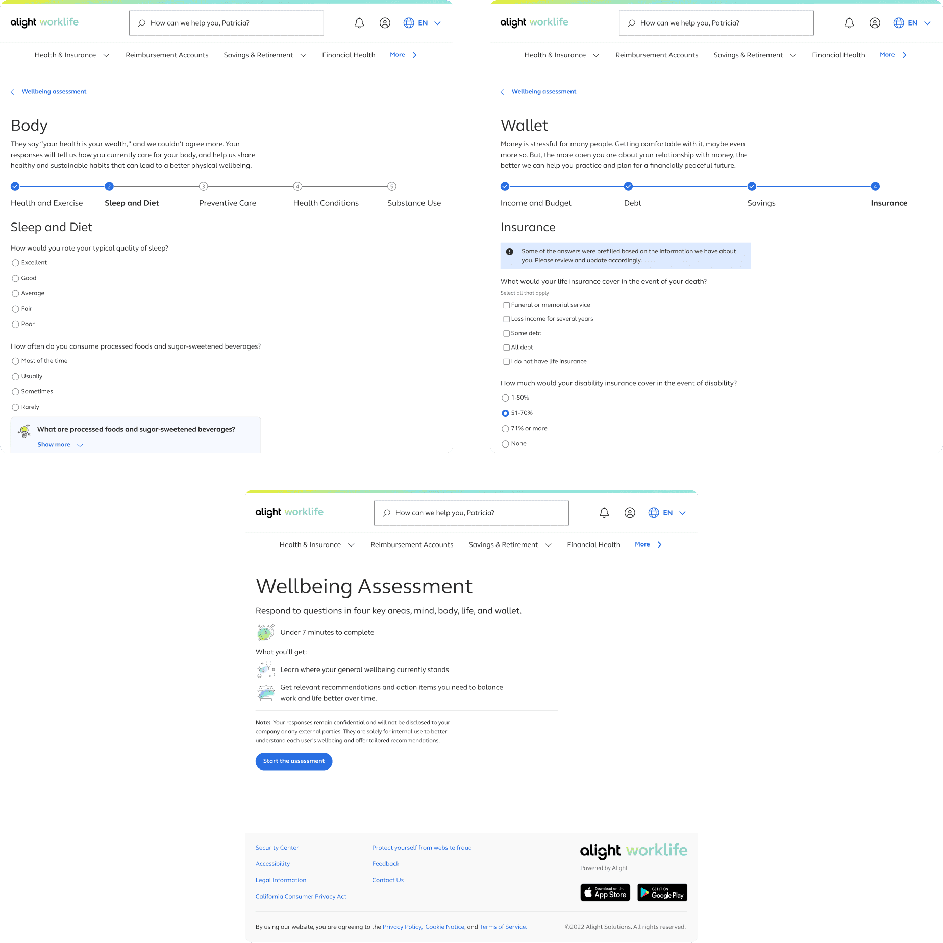
Appereance
Having defined the content and structure at this stage allowed us to complete the UI design quickly and move rapidly into the testing phase
At this stage, following the strategy I defined proved to be a significant success. By setting visuals aside in the first two stages, we could focus on what truly mattered. Since the assessment required a simple user interface, this stage was completed seamlessly.
For the landing screen, we explored multiple options and chose the one that best highlighted the benefits and set clear expectations
Key decisions:
- Provide a general explanation of the benefits, making it more prominent by increasing its size.
- Using bullet points for key topics and time to complete makes important information easier to spot.
- Even tought having the pillars on the right, and using them as shortcuts to get to specific areas was one of the ways of providing more value on the right side, this option was more complicated to scale for returning users, as more changes needed to be done to the message.
- To maintain consistency with other assessments on the platform, we added an illustration on the right side that best communicated the completion of the assessment from our set.
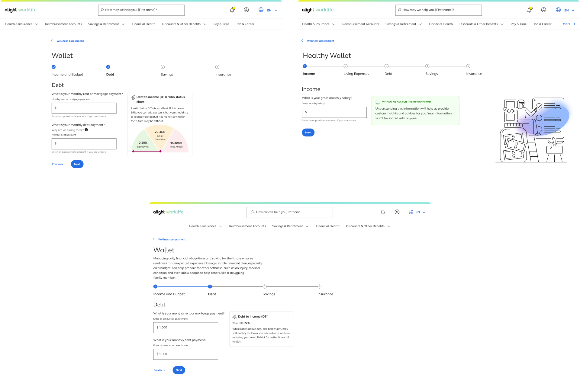
The form pages were crucial, and although we wanted to better utilize the space available, we had to adhere to the design system guidelines
Key decisions:
- Keep everything left aligned to adhere to the system rules, leaving the right side blank to avoid distractions and maintain focus on the questions.
- While insights are a business requirement, they don't add significant value. Minimizing they appearances to show only the fundamental ones, and keeping them to the side minimizes distractions.
- Although providing a description for sensitive questions explaining how the information will be used would be ideal, due to resource limitations, a more general explanation is added under the title.
Usability Testing
The design met the overall objectives, but we needed to emphasize more the benefits and how the information would be used to boost completion rates
Two studies were conducted. The first focused on identifying usability issues, unclear questions, and evaluating the
clarity of navigation, the value of insights, and the reasons why users would take or complete the
wellbeing assessment.
Key findings:
- Clearer benefits would increase participant motivation.
- There was a set of questions that were still not entirely clear.
- Few insights were valuable; the rest were ignored or deemed irrelevant.
The second study explored user behavior and reactions to sensitive questions, aiming to understand
why some users might not complete the entire assessment.
Key findings:
- Participants were willing to complete it, but sharing personal information might affect accuracy and completeness rate.
- The assessment length was considered appropriate given the upfront expectations and the benefits received.
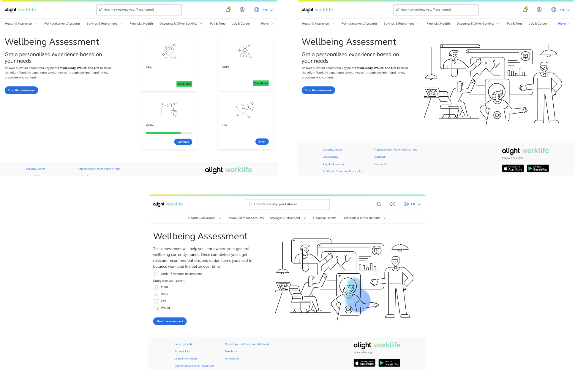
Final Design
I proposed prioritizing the findings by impact, allowing us to focus on the most beneficial changes within the available timeframe and save smaller details for future enhancements
Some findings required collaboration with multiple teams, including management and content. Regular review meetings
ensured continuous feedback, allowing us to design a final version that met both user and business needs.
Key decisions:
- Remove the big illustration to reduce distractions, and instead use smaller ones as bullet points on the landing screen to better highlight the benefits and timing.
- Communicate better the main benefit on the screens where this section appears.
- Leverage available user data to prefill some questions and reduce effort.
Next Steps
Unfortunately, the project was deprioritized and not launched. However, we had clear next steps and a vision for future improvements
- With the second version, we planned another round of testing to confirm the effectiveness of our changes. When the project resumes, this will be the first step.
- At the beginning we ideated ways to encourage the completition of the assessment outside of it, but as the request was only on the assessment, we left those ideas for a future state.
- We aimed to specify the reasons for each private question to enhance transparency, build trust, and increase completion rates. If we had more supporting data and resources, this would be a valuable improvement to consider.
What I Learned
Developing a plan before tackling the problem to minimize project friction
- Without a clear strategy, the project would have been chaotic, with wasted time revisiting earlier stages due to issues found later.
- Documenting agreements is helpful for reviewing the reasons behind decisions if needed later.
- Even if stakeholders have a clear vision of the final product, clearly communicating the rationale behind decisions helps them understand the reasoning, reconsider their opinions if necessary, and provide valuable insights for improvement.